- Home
- Blog
- Print Work Column
- Color and Pattern Matching Tips for Team Apparel Design
Color and Pattern Matching Tips for Team Apparel Design

When designing team apparel, the combination of colors and patterns plays a crucial role in the final outcome. Whether for a business, school, or sports team, the color and pattern coordination of team apparel can convey the team's spirit and image. This article will introduce some effective color and pattern matching techniques for team apparel design, helping you create designs that are both visually appealing and professional.
1. Color Coordination: Choose Colors that Match the Team's Image
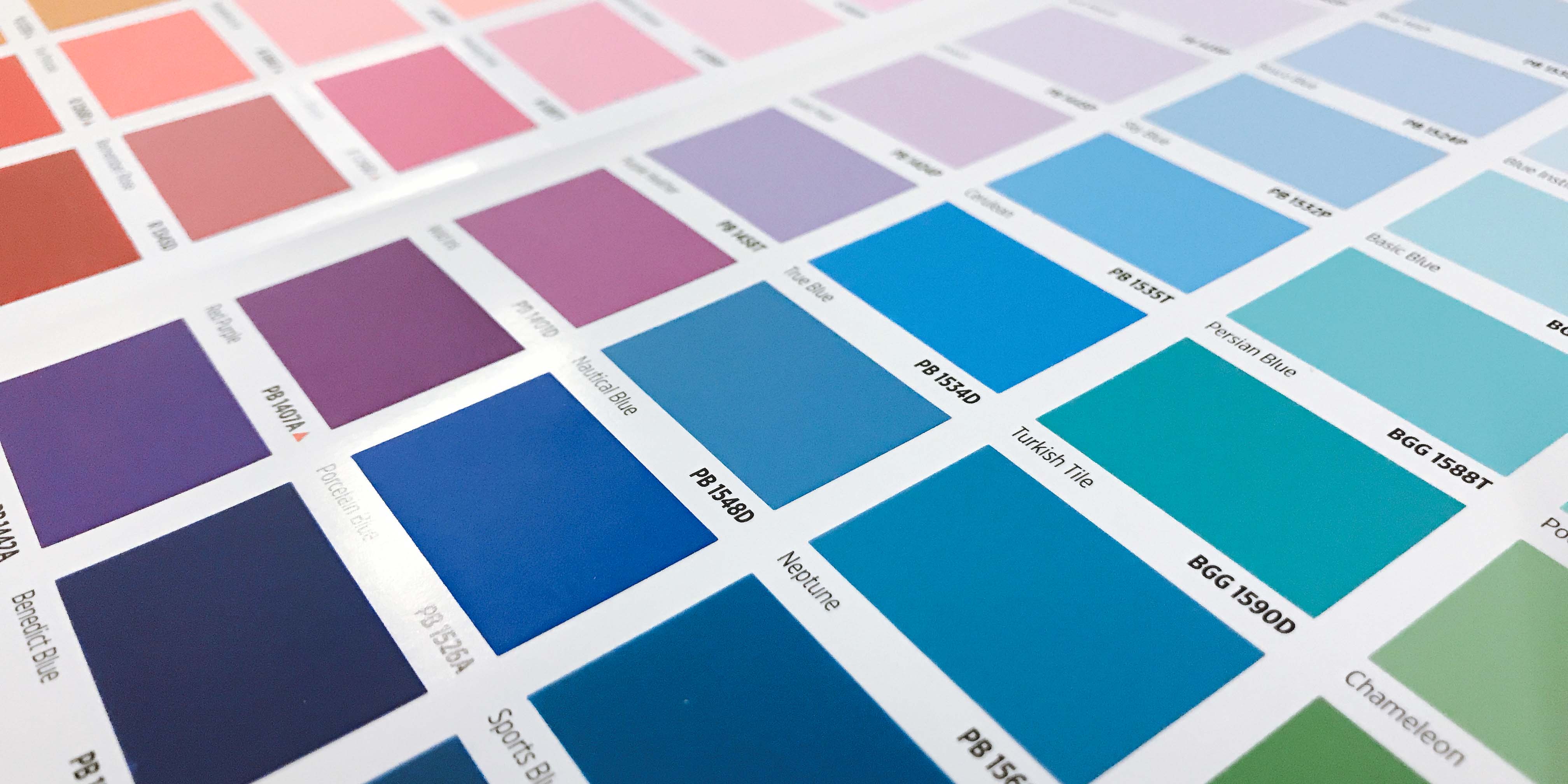
Color is one of the most direct and attention-grabbing elements in design. Choosing the right colors for the team’s image can enhance the recognition of the team apparel design and convey the correct message. For example, red typically represents energy and passion, making it ideal for sports teams, while blue symbolizes professionalism and stability, making it suitable for corporate or school uniforms. It’s usually recommended to choose 2-3 primary colors as the base to avoid visual clutter caused by too many colors.
2. Color Matching Techniques: Use Contrasting or Complementary Colors
Using contrasting or complementary colors is a common technique when pairing colors. Contrasting colors can add visual impact, such as the combination of red and green. Complementary colors create a harmonious effect, like blue and orange. Depending on the team's style and purpose, selecting an appropriate color scheme can make the team apparel design feel more dynamic or stable.
3. Pattern Design: Keep It Simple and Highlight Unique Features
When designing the patterns for team apparel, simple yet distinctive designs tend to stand out more. Overly complicated patterns can create a cluttered visual effect. Common designs include iconic patterns, geometric shapes, or simple text slogans. For corporate team apparel, a simple company logo is a good choice, while sports team apparel can feature symbols with meaning.
4. Font Coordination: Choose Clear and Readable Fonts
Fonts play an important role in team apparel design, especially when adding text or slogans. Choosing simple, easy-to-read fonts ensures that the text is clear and visible. Sans-serif fonts typically look more modern, while serif fonts are more formal. Selecting an appropriate font based on the team’s style helps enhance the overall professionalism of the design.
5. Balancing Patterns and Colors
The combination of patterns and colors must achieve a certain balance. Overly complex patterns combined with bright colors may make the design appear too extravagant, reducing its professional appearance. A well-balanced combination can create a visually appealing yet professional team apparel design. During the design process, you can reduce the number of colors and place the patterns in key visual areas to make the overall look more harmonious.
Conclusion
The combination of colors and patterns plays a key role in team apparel design. Choosing colors that match the team’s image, using contrasting or complementary colors, keeping patterns simple, and selecting appropriate fonts can enhance the visual effect and brand image of the team apparel. With careful design and coordination, you can create team apparel that is both attractive and meets the needs of your team.
Article Classification
Recent Articles
- A Detailed Guide to the Custom Teamwear Process: From Order to Delivery
- How to Calculate the Cost of Custom Teamwear? A Comprehensive Guide to Quotation Process
- Introduction to Common T-Shirt Printing Techniques: Which One is Best for Your Needs?
- Color and Pattern Matching Tips for Team Apparel Design
- 5 Key Elements You Need to Know Before Customizing Team Apparel


